
Jetpack ComposeでAlertDialogを表示する
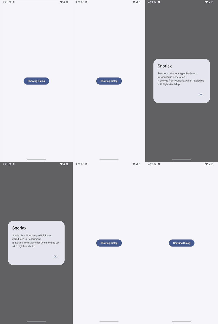
ボタンでダイアログを開き、OKボタンで閉じる例です。
実装のポイント
openDialog.valueがtrueのときだけAlertDialogを表示します。OKボタンでfalseに戻すと、ダイアログが閉じます。
このサンプルではonDismissRequest = {}としているので、ダイアログの外側のタップや戻る操作では閉じず、OKボタンで閉じます。外側のタップでも閉じたい場合は、このコールバックでopenDialog.value = falseにします。
準備
Android StudioのCompose対応プロジェクトで、Material 3を使用します。以下のコードではパッケージ名をcom.swiswiswift.swiswikotlinにしています。自分のプロジェクトに合わせて変更してください。テーマはMaterialThemeに揃えています。
各記事は独立したサンプルです。同じプロジェクトで試す場合は、前のサンプルのMainActivityやContentViewを置き換えてください。
コード
MainActivity.kt
package com.swiswiswift.swiswikotlin

import android.os.Bundle
import androidx.activity.ComponentActivity
import androidx.activity.compose.setContent
import androidx.activity.enableEdgeToEdge
import androidx.compose.foundation.layout.fillMaxSize
import androidx.compose.foundation.layout.padding
import androidx.compose.material3.MaterialTheme
import androidx.compose.material3.Scaffold
import androidx.compose.ui.Modifier

class MainActivity : ComponentActivity() {
    override fun onCreate(savedInstanceState: Bundle?) {
        super.onCreate(savedInstanceState)
        enableEdgeToEdge()
        setContent {
            MaterialTheme {
                Scaffold(modifier = Modifier.fillMaxSize()) { innerPadding ->
                    ContentView(modifier = Modifier.padding(innerPadding))
                }
            }
        }
    }
}
ContentView.kt
package com.swiswiswift.swiswikotlin

import androidx.compose.foundation.layout.Arrangement
import androidx.compose.foundation.layout.Column
import androidx.compose.foundation.layout.fillMaxSize
import androidx.compose.material3.AlertDialog
import androidx.compose.material3.Button
import androidx.compose.material3.Text
import androidx.compose.material3.TextButton
import androidx.compose.runtime.Composable
import androidx.compose.runtime.mutableStateOf
import androidx.compose.runtime.remember
import androidx.compose.ui.Alignment
import androidx.compose.ui.Modifier
import androidx.compose.ui.tooling.preview.Preview
import androidx.compose.material3.MaterialTheme

@Composable
fun ContentView(modifier: Modifier = Modifier) {
    val openDialog = remember { mutableStateOf(false) }

    if (openDialog.value) {
        AlertDialog(
            onDismissRequest = {},
            title = {
                Text(text = "Snorlax")
            },
            text = {
                Text("Snorlax is a Normal-type Pokémon introduced in Generation I.\nIt evolves from Munchlax when leveled up with high friendship.")
            },
            confirmButton = {
                TextButton(
                    onClick = {
                        openDialog.value = false
                    }
                ) {
                    Text("OK")
                }
            },
            dismissButton = null
        )
    }

    Column(
        modifier = modifier
            .fillMaxSize(),
        horizontalAlignment = Alignment.CenterHorizontally,
        verticalArrangement = Arrangement.Center
    ) {
        Button(
            onClick = {
                openDialog.value = true
            }
        ) {
            Text("Showing Dialog")
        }
    }
}

@Preview(showBackground = true)
@Composable
fun ContentViewPreview() {
    MaterialTheme {
        ContentView()
    }
}